Naturgy | Digital Redesign

line-emphasis

Context and challenge

Naturgy needed to redesign its website with a more user-centric approach. The goal: To make it more usable, coherent, and easy to scale. They also wanted to launch digital campaigns with a flexible visual approach, adaptable to different media and audiences. The challenge: To assemble a team that would make this goal a reality in a highly agile and timely manner.

Rol:

UI / UX

Visual Design

Front-end

Art Direction

line-emphasis

Process

In the Naturgy redesign, we worked with an agile methodology, organizing the project into weekly sprints. From the UX/UI team, which I had the opportunity to lead, we approached the design with a total focus on the user. We divided the process into four key stages:

1. Discovery

We listen to the business, analyze users, and study behavior on the existing website. Here we identify the main points of friction and opportunities for improvement.

2. Solution Modeling

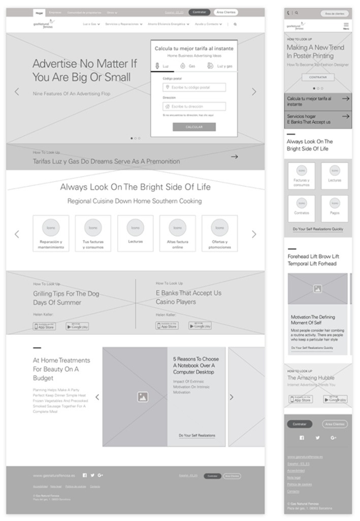
We translated these learnings into flows, wireframes, and information architecture. Everything was designed to make navigation simpler and more intuitive.

3. Mockups and Prototypes

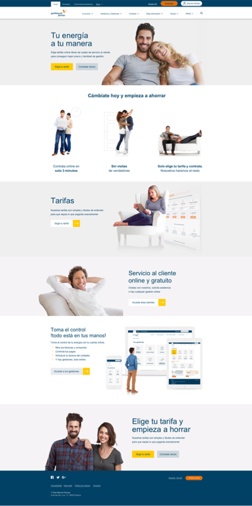
We designed the key screens using the new visual system and tested them in navigable prototypes. We were looking for clarity, accessibility, and efficiency.

4. Implementation and Evaluation

We collaborate with the development team to integrate the design into the CMS. Once published, we analyze real-world data to measure the impact: navigation, clicks, bounce rate, and more.

Wireframe naturgy
mockup home page naturgy site
line-emphasis

Style guide

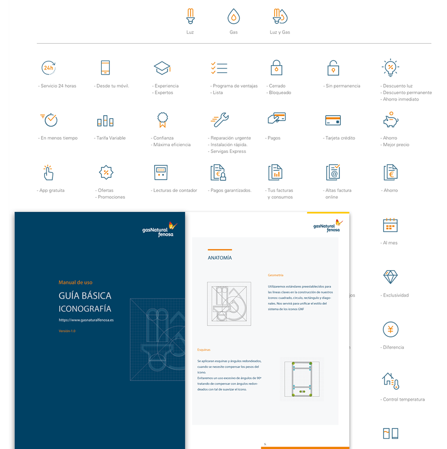
I defined a centralized modular design system in Zeplin to ensure visual consistency and efficiency. The entire team—design, development, and QA—accessed the same graphic resources, components, and updated guides. We structured reusable tokens, fonts, colors, and layouts using Figma. Zeplin generated development-ready specs, measurements, and assets with integrated documentation.


The system grew alongside the product, with controlled versions and continuous feedback. This way, we avoided ambiguities, accelerated deliveries, and improved the quality of the final design.

line-emphasis

Lead Generation Actions

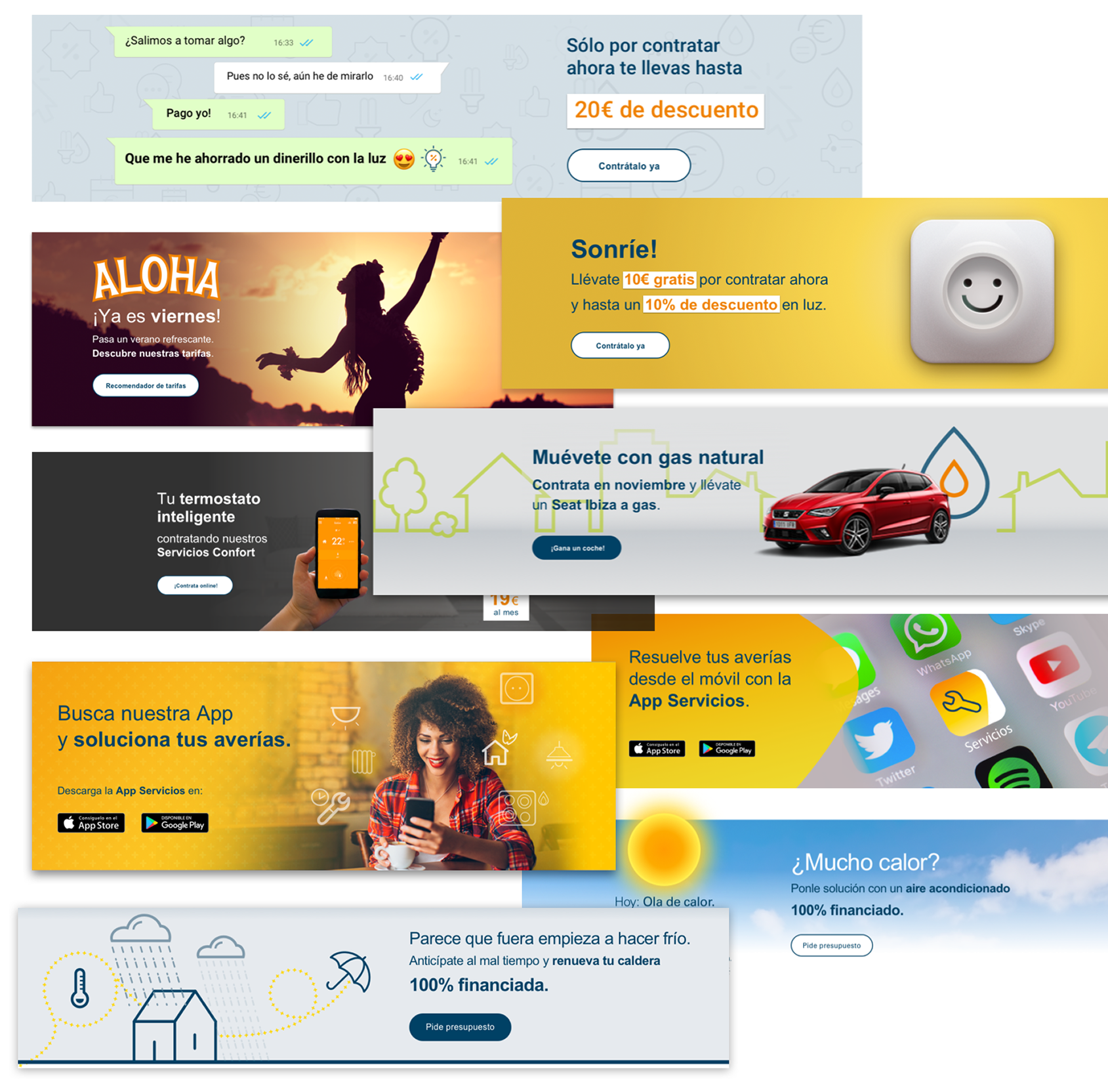
I designed promotional campaigns aimed at user acquisition with Rubén López, combining art direction, UI design, and content adaptation. We created agile landing pages, banners, and conversion-optimized pieces, always aligned with the brand’s design system and tone. We worked as a creative duo, focusing on a clear and direct visual narrative, with special attention to the digital context and user touchpoints.

Campagins capture leads for customers